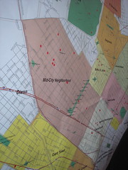
There have been about 200 official plans since then, the latest being last weekend. This is supposed to be the real super-unified really really this time it's true plan. I skipped it. Mostly it's because I'm so busy working on finishing our house. But it was healthy not to be there. So much money could be spent on rebuilding houses, and instead it all goes to the "planners" who I wouldn't trust to plan my son's upcoming 8th birthday party. Apparently the biggest change this time around is that the dots have evolved from red to orange, as you can see in this picture from Karen Apricot forwarded to me by Karen Gadbois.
Do you see that? The dots were red, and now they're FREAKIN' ORANGE! Way to go planners. I'd like to see some more research on how many people in my neighborhood are fans of the fleur-de-lis. Maybe people opposed to the fleur de lis put the dots in the wrong place.
3 comments:
Looks like they used bigger dots this time as well. That's good. It helps to support the illusion of participation and inclusiveness.
Are we sure they aren't taking their color scheme from the terrorist alert scale? The neighborhood's been downgraded as a possible terrorist risk! We should be pleased and relieved, I guess...
Both Schroeder and Leigh are correct. The dot's have gotten bigger, so our opinion is more important now, and we are safer from a terrorist attack. Perhaps when Bush leaves office the stickers will be yellow.
Post a Comment